
Having the perfect app performance is the key to engaging more visitors. When competition gets higher, quality is what matters!
With so many apps targeted at attracting more and more clients, developers should now be highly cautious about their app quality.
And that’s exactly what the perfect User Interface does! Having the perfect User Interface (UI) design ensures better interaction of the users with your website or application, which consequently identifies their further interaction as customers with products or services presented there. In other words, the perfect interface design can not only provide the best user experience (UX) and traffic increase but also is the most effective way to boost your business performance.
Based upon Jakob Nielsen’s “Ten Usability Heuristics”, 10 general principles for interaction design, and Ben Shneiderman’s “Designing the User Interface” I’ll explain the top 10 golden rules for app UI designing.
In this article, you will learn about the golden rules of creating the perfect UI (user interface) design with examples and tips to benefit your online business. Let’s get this started!
TOP 10 GOLDEN RULES FOR APP UI DESIGNING
1. CONSISTENCY IS THE KEY IN PERFECT UI DESIGNING
Using different words or icons for the same things or actions could confuse them. And a confused user might skip to some other service or app than yours. For the perfect UI design consistency is the key- never confuse your users.
Jakob’s guidelines for UI design back this by stating that people spend most of their time using your competitor’s apps or digital products other than yours. This is simply because the competitor provides a better user experience with their consistent UI. Failing to maintain the app UI consistency forces them to learn new things to use a simple app and thus increase the users’ cognitive load.
Users don’t like surprises when it comes to using an app or a digital product. So, to create the perfect UI design you should use the “Principle of least surprise” and maintain consistency throughout your app.
In other words, all elements in your application must appear consistently. For example, a certain style of the button should always do the same thing, the previous screen button should be named only one thing (either return or back) or navigation should function logically and as per the hierarchy.
Example of consistency in UI designing:
- Most applications have an app UI design that provides users with quick login features like login with the App Store of Google, if your app asks for a detailed form then the user might just skip to some other app.
- The wish list is usually placed near the shopping cart. This consistency meets customers’ expectations and prompts them to buy quickly.
Tips to maintain consistency of functionality, appearance, and terminology in your app UI:
- Improve learnability by maintaining both internal and external consistency.
- Internal consistency means within a single product or a category of products or services.
- External consistency means following industry-set conventions.
2. VISIBILITY OF SYSTEM STATUS OR INFORMATIVE FEEDBACK IS THE BACKBONE OF THE PERFECT UI
The app UI system should always keep users well-informed about what is going on. System status can be made visible through appropriate feedback within a reasonable time. Never keep your users guessing or surprised — give them feedback on whatever is happening and keep them informed.
The user likes to be in control as this builds trust that the system will act as expected by the user. So, the app UI design should always keep users well informed about the system updates, to make them feel that they are in control.
When the users know everything about the current system status, they know the final outcome prior to the first. Such predictable app interactions create trust in the product as well as the brand.
Example of visibility of system status:
- OS Installation status
- Within the app, if you delete something, you get a warning that it will be permanently deleted
Tips to maintain visibility of system status or provide feedback
- Clear and concise communication is the key — no action should be initiated without the final outcome being informed to the users in advance
- Too much feedback is also bad, rather it must be relevant and important for the users
- Feedback of system status should be done immediately.
- Build trust with your users through open and instant communication.
3. MATCHING THE SYSTEM WITH THE REAL WORLD IS ESSENTIAL IN UI DESIGNING
Using fancy words or design might sound like a brilliant and unique way to create your app, but it’s not. If you want your app to reach a wide audience then simple app UI designing is the way to go. The system should speak the users’ language, and look the way they want rather than special design or system terms.
The app actions hierarchy should be organized into groups and when a process is finished, remember to display a notification message. Let the user know that they have completed all the necessary steps(For example, in payment apps like PayPal, you need to enter all the financial details, but once done you can use the service seamlessly.)
Moreover, the app UI design should speak the users’ language. Use words, phrases, and concepts familiar to the user, rather than complex technical language. ( for example, security “password or pin” is easier to understand than “security access code” Use real-world conventions, easy-to-understand UI design, and language to make information easier to understand.
When an app UI design follows real-world conventions and responds to the desired outcomes, it makes it easier for users to learn and remember how the app UI works. This helps to build an intuitive and logical user experience.
Example of app UI design that creates a match between the system and the real world:
- Gaming apps that use the FPP(First-person perspective) mode of gaming to give a real-world feel
- PayPal Payment proceeding to make payments easy like paying in cash
Tips for designing app UI to match the system and the real world:
- Ensure that users can understand meaning without having to go look up a word’s definition.
- Never assume your app users will also have the same level of understanding of technical terminology as yours.
- Conduct research to understand your users’ familiar terminology and their expectations.
4. THE PERFECT UI DESIGN MUST OFFER USER CONTROL, FREEDOM AND EASY REVERSAL OF ACTIONS
“This feature relieves anxiety since the user knows that errors can be undone; it thus encourages exploration of unfamiliar options.” As said by Ben Shneiderman.
Users often carry out some app actions accidentally. Your app UI design must provide a clear “emergency exit” to leave the accidental action without having to go through the entire process again and again. (For example, if a user fills in an incorrect detail in a form then he/she must be able to remove that individual detail rather than filling the entire form again).
The ability to undo mistakes or other actions builds a sense of freedom as well as confidence among the users. Exit options allow users to be in control of the app and avoid getting stuck or confused.
In apps, this basically refers to the undo and redo functionality.
Example of App UI that ensures user control and freedom:
- Google Images never permanently deletes your images in the first go
- Document History on your phone
Tips to create an app UI that gives your users more freedom:
Support Undo and Redo, and action history.
Show a clear way to exit the current action, like a Cancel button.
Make sure the exit option is clearly labeled and easily discoverable.
Exit or cancellation must not interfere with the workflow.
5. ERROR PREVENTION AND SIMPLE ERROR HANDLING WHILE UI DESIGNING
Everyone hates errors, but the feeling that the users themselves have done something wrong is worse. This drives users away from your app and thus makes you lose a potential customer.
So, it is best to either totally eliminate error-prone conditions or check for them and notify users in advance before they commit to the action.
As much as possible, design the app UI system so that there is no chance of making any serious errors. However, if an error is made, the system should be able to detect that error and offer a simple handling mechanism instantly and comprehensively.
Clear error messages are important, but the best app UI designs prevent the problems from occurring in the first place.
There are two main types of errors: slips and mistakes. Slips are not deliberate but rather unconscious errors caused by not giving proper attention. Mistakes are conscious errors caused by a mismatch between the user’s understanding and the app UI design.
Example of preventing errors in your app UI:
- In technical apps like insurance and finance apps, you find caution points to avoid mistakes
- While making a new Password it shows the necessary requirements
Tips for error prevention while designing your app UI:
- Prioritize your prevention over correction: Prevent high-cost errors first, then little frustrations.
- Avoid slip mistakes by providing necessary constraints and good defaults.
- Prevent mistakes by removing memory burdens, supporting undo, and warning your users
- Automatic detection of errors and Offer solutions for problems
6. CREATE UI DESIGN BASED ON RECOGNITION RATHER THAN RECALL
As Nielsen says, recognizing something is much easier than remembering it, and it is very true, especially for visual recognition. Focus on minimizing the user’s memory load: The user should not have to remember information from one part of the app to another. Instructions should be clearly visible.
Use icons (like “!” For help) and other visual aids such as themed UI design and consistent placement of items to help the returning users find the functionalities.
Create an app UI design so that it minimizes the user’s memory load by making elements, actions, and options visible. Information required to use the app UI design (e.g. field labels or menu items) should be visible or easily retrievable when needed.
Humans tend to have limited short-term memories. The app UI that focuses on recognition more reduces the amount of cognitive effort required from users.
Example of using recognition in your app UI:
- Almost in every app or digital product “!” represents help
- Cab pick-and-drop apps tend to save your recent locations
Tips for using recognition rather than recall while designing your app UI:
- Let people recognize information in the interface, rather than forcing them to remember (“recall”) it.
- Offer help in context, instead of giving users a long tutorial to memorize.
- Reduce the information that users have to remember.
- App clear structure for Implicit help by Visual aids
7. ENABLE FREQUENT USERS TO USE SHORTCUTS IN YOUR APP UI DESIGN
Shortcuts in your app UI design are very helpful to an expert or frequent user. Shortcuts that may be hidden from newbie users will speed up the app interaction for the expert user so that the app UI design can cater to both. Allow users to customize frequent actions, like setting alarms for daily chores.
Example of using shortcuts in your app UI design:
- Different devices provide different mechanisms to take screenshot
- Click Commands and Shortcuts
Tips for incorporating shortcuts in your app UI design:
- Provide keyboard shortcuts and touch gestures in your app UI design.
- Provide personalization of content and functionality for individual users.
- Automate frequently used operations
8. AESTHETIC AND MINIMALIST APP UI DESIGN IS THE BEST
Minimalist app UI design doesn’t mean a limited app UI design. Minimalism means that all information should be available in minimal possible steps.
You should simplify app UI design by removing unnecessary or complicated steps or content.
The app UI design should not contain any irrelevant information that just takes up the screen space. Every extra unnecessary unit of information in the app UI design competes with the relevant units of information and may overshadow their visibility.
This doesn’t mean you have to use a flat UI design, rather it’s about keeping the app content and visual design focused only on the essential app UI elements.
Example of using minimalistic and aesthetic design for your app UI:
Most of the news apps are quite minimalistic with limited UI elements like: daily news, monthly magazine live updates, and your subscription; and that’s all that a news app actually needs.
Tips to create a minimalistic and aesthetic app UI design:
- Keep the content and visual design of the UI focused on the essentials.
- Don’t let unnecessary elements distract users from the information they really need.
- Prioritize the content and features to support primary goals.
9. HELP USERS RECOGNIZE, DIAGNOSE, AND RECOVER FROM ERRORS WITH YOUR PERFECT UI DESIGN
Error messages should be expressed in plain language (don’t use system language to describe what the system is doing), precisely indicate the problem, and constructively suggest a solution.
Tell the user clearly and plainly what’s happening both in the background and when they perform an action.
Error messages should be expressed in plain language (no error codes), precisely indicate the problem, and constructively suggest a solution.
These error messages should also be presented with visual treatments that will help users notice and recognize them.
Example of App UI design to recognize errors easily :
When you use MS Excel and try to run some function, if that function is incorrect you get a detailed dialogue box information about what all might be wrong.
Tips to help users recognize errors easily while designing your app UI:
- Use traditional error-message visuals, like bold, red text.
- Tell users what went wrong in the language they will understand — avoid technical jargon.
- Offer users a solution, like a shortcut that can solve the error immediately.
10. HELP AND DOCUMENTATION SHOULD BE INCLUDED IN YOUR APP UI DESIGNING
Even though it is better if the interface can be used without documentation, it may be necessary to provide help and documentation. Any help information should be easy to search, focused on the user’s task, a list of concrete steps, and not too large.
It’s best if the system doesn’t need any additional explanation. However, it may be necessary to provide documentation to help users understand how to complete their tasks.
Help and documentation content should be easy to search and focused on the user’s task. Keep it concise, and list concrete steps that need to be carried out.
Example of easy documentation and help while designing your app UI:
Time and work management apps often have a detailed guide as well as a first-time download app tour to make the app UI design familiar for the users.
Tips for creating app UI design that provides easy documentation support:
Ensure that the help documentation is easy to search.
Whenever possible, present the documentation in context right at the moment that the user requires it.
List concrete steps to be carried out.
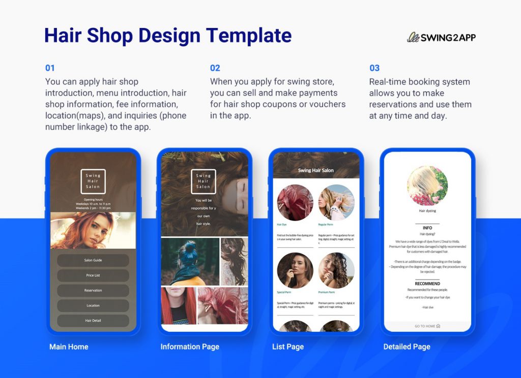
WITH SWING2APP YOU DON’T NEED TO WORRY ABOUT UI, YOU GET PRE-BUILT TEMPLATES
Swing2App no-code app builder provides you with pre-built UI designs that can be easily edited without any coding at all!
The Swing2App templates are industry-specific and include all the necessary features which can be easily added. Moreover, you can also add other features without any coding!
Check out the following hair salon template provided with Swing2App no-code app builder.
Read more about Swing2App templates here.
With Swing2App templates you don’t need to worry about Play Store or App Store UI guidelines as each template is of top quality and provides a seamless experience to the users.