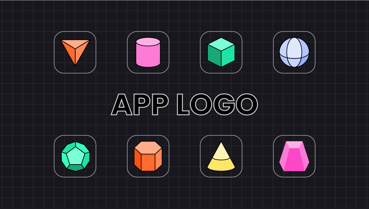
To start with busting the common misconception, app icons are not logos.
App icons are visual anchors for your apps that play a huge role in an app’s success, irrespective of how small they may seem in their significance. They are a type of branding that users initially come in contact with.
To be more precise, a logo is a representation of a brand that helps customers associate with the company, its services, values, etc.
Whereas, an app icon helps people identify with the mobile app of the company. Therefore, app icons should not only be attractive but also represent the brand’s identity and distinguish itself from other similar apps or icons to stand out from the crowd.
Your app icon should communicate the kind of value the app will give to the users because everything is on that first look and interaction. Unlike, logos, icons are quadratic and must adhere to guidelines from app stores.
To understand the importance of app icons, let’s look at some remarkable app examples.
Facebook – Who can resist the attractive vibes we get from the big “f” of Facebook? Although the logo is very minimalistic and simple, the color combination is an attractive feature, representing the brand color is the most effective way.

Netflix – With very bold and attractive colors, Netflix also portrays its brand colors in an obvious yet remarkable way that no one can miss out on. It makes it unique and easily distinguishable.

Google maps – Besides the iconic and colorful “G” of Google which represents the company itself, Google Maps literally uses the graphic version of a map. It helps people identify in an instant what is the primary feature of the app.

When it comes to designing an app icon, there are a lot of parameters to consider and a lot of mistakes to avoid. But, how will you be able to know the mistakes to avoid before you even make them?
In this article, we will provide you with clear and concise points on how to effectively create app icons that establish a brand in users’ minds instantly.
Do’s And Don’ts While Creating An App Icon
Do’s:
1.Make it unique
There is a misconception among people that if something is simple, it can’t be unique. Well, I guess we already busted this bubble with Facebook and Netflix’s logos.
The key to making your app unique while still simple is picking the shape that is bold and marks an impression into the users’ minds.
Another great tip is to show the primary features of your app into the app icon, just like how Google Maps has done it.
Let the app icon speak for the app itself.
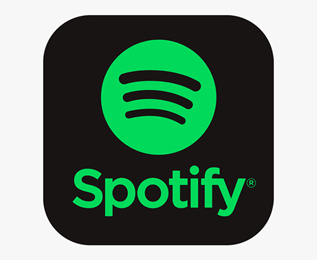
Another great example is Spotify. It uses bold colors, simple yet unique shape in which the black lines represent the volume in a speaker. It instantly lets users know that it is a music app.
Another similar example is the Google Play Music app –

2.Use few vibrant colors
While creating an app icon, it is crucial to keep the background of the users in mind. You may look good in itself, you may think it is bold and memorable. But what if the UI background of the users’ devices is something in which your app just submerges, or it blends in with the other apps on the app stores?
You can eliminate this scenario for your app by choosing the right and vibrant combination of colors that stand out among other apps but also represent the brand.
3.Try app icons variations and A/B test them
You do not have to commit to a single idea right away. Even if you like one design, you can experiment around it and create variations of the same design.
Now, imagine each one as the icon logo and select the one you think stands out the most, attract the most attention, is easily memorable, and represents the brand. You can also A/B test these logos using tools to facilitate you in the process.
4.Prepare icons for multiple screen sizes
When it comes to smartphones, there is a lot of fragmentation in space. Even a single company can have multiple devices with different screen resolutions or devices from different companies operating on the same OS such as Android.
You need to make your app logo scalable and to be able to adapt well to every screen size and resolution.
Don’ts:
1.Avoid adding text
Again, due to the small size adding text into the icon space will not be a smart move. Firstly, users will not want to read the text in an icon, second, it does not make sense to make them read when you can simply appeal to their visual senses.
2.Don’t make it overwhelming
In an attempt to make the app icons highly unique and distinct, some brands go overboard with loud colors, heavy graphics, and animation which is all over the place.
Because an app icon is very small in size, you should focus on bringing forth a center in the icon instead of stuffing multiple elements that scatter the users’ attention.
However, there are some exceptions such as gaming apps. Many apps use animation and heavy graphics to make the logos attractive or to the characteristics of the app. Take an example of the gaming app Call of Duty –

3.Avoid being two peas in a pod with competitors
Blue is among the most commonly used colors globally, therefore many businesses have made it their brand color, thus, their apps use this in the app icons as well.
Another instance of the letter “A”. A lot of brands starting with A tend to favor certain types of logos and thus, end up creating app icons that are nearly similar.
Although you are aiming towards simplicity, you do not have to be basic, because it is what most people go for, which is well explained in the above example of companies starting with “A”.
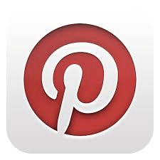
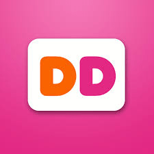
4.Don’t use more than two letters
Similar to the text thing, you do not want to confuse the users with an app icon that has too much going on. If you are planning to add initials of your app’s name like Pinterest, make sure you only add up to two letters.
An example of using two letters in a logo without making it off-putting is Dunkin’ Donuts. The colors are vibrant and the initials stand out.
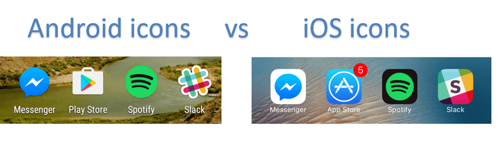
Take care iOS and Android different icon policy
While designing app icons, one of the crucial things is to adhere to the guidelines presented by the app stores. Not just at the end of the designing process, but it would save you a lot of trouble if you keep these guidelines in the loop while brainstorming about the logo.
Both iOS guidelines and Google’s Human Interface guidelines have their own requirements. For instance, you can create a transparent background for your app icon while making an app for Android, something that iOS does not follow.
It would be better to create an app icon that will work for both platforms. Because you do not want to have two app icons for your app on different platforms. So, shortlist the components while designing that both the platforms support.
App icon attributes for iOS:
| Attribute | Value |
| Format | PNG |
| Color space | Display P3 (wide-gamut color), sRGB (color), or Gray Gamma 2.2 (grayscale). |
| Layers | Flattened with no transparency |
| Resolution | Varies as per iPhone |
| Shape | Square with no rounded corners |
App icon attributes for Google Play Store:
| Attribute | Value |
| Final size | 512px x 512px |
| Format | 32-bit PNG |
| Color space | sRGB |
| Max file size | 1024 KB |
| Shape | Full square, Google handles masking. Radius will be equivalent to 20% of icon size |
| Shadow | None, you can create shadows and lighting within the artwork |
iOS guidelines , Android guidelines
Add your App Icon with Swing2App and create your no code app
By this time, you might be knowing a lot about app icons and how to create them. Now let’s see how to apply your app icon using swing2app and what are the prerequisites.
Even though app icon appears quite small on mobile screen, however it is quite essential that you create your app icon of high resolution. Swing2app’s recommended app icon size is 1024* 1024 pixels. While creating your app icon you should ensure it has proper size and resolution, otherwise it may look distorted upon uploading.
If you are well versed with designing tools you may create app icon on your own using only professional software like photoshop or illustration. Otherwise, you can consult a designer.
App icons look small on the phone, but you need to work at a very high resolution.
The recommended icon size for the app is 1024 px * 1024 px.
You should make it in the appropriate size before uploading the image as your app’s icon.
Once you are all set with your app icon all you have to do is sign up for Swing2App no code app developing platform and follow the steps:
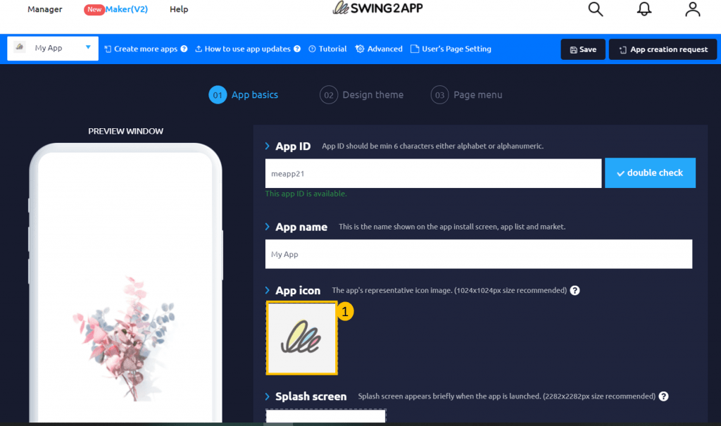
1.Go to Maker(V2) Page, enter your app name, id and save it.
2.Then on the 1st page of Maker(v2), that is App Basics, click on App Icon.
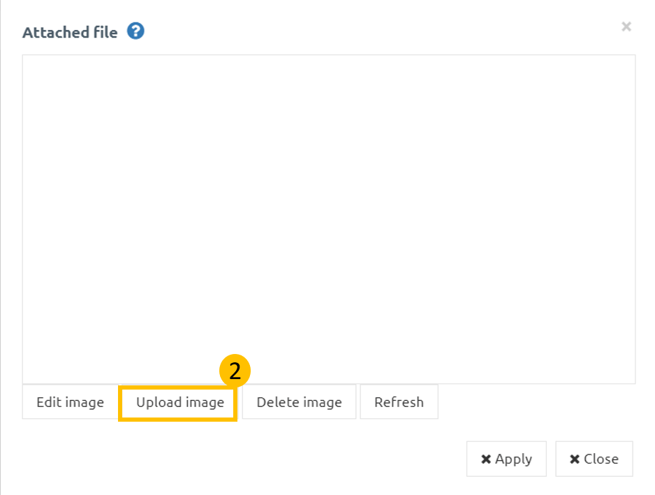
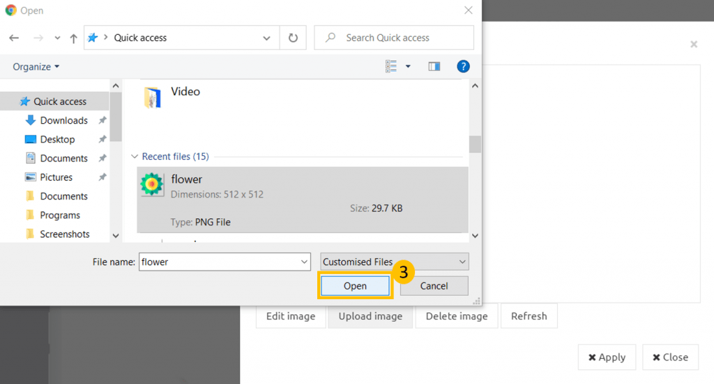
3. A pop up screen will open, then you can upload App Icon created by you by clicking on upload.
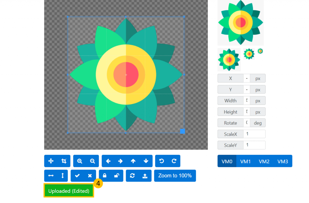
4. You can also edit your image by clicking on edit.
5. Once you click edit a new window will open, where you can edit your image, after editing you have to click on upload(edited) and then okay.
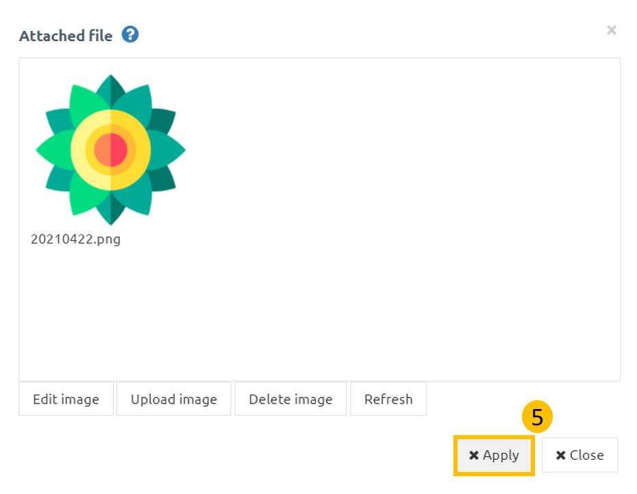
6. Finally click on apply, and your App Icon is applied to your app.
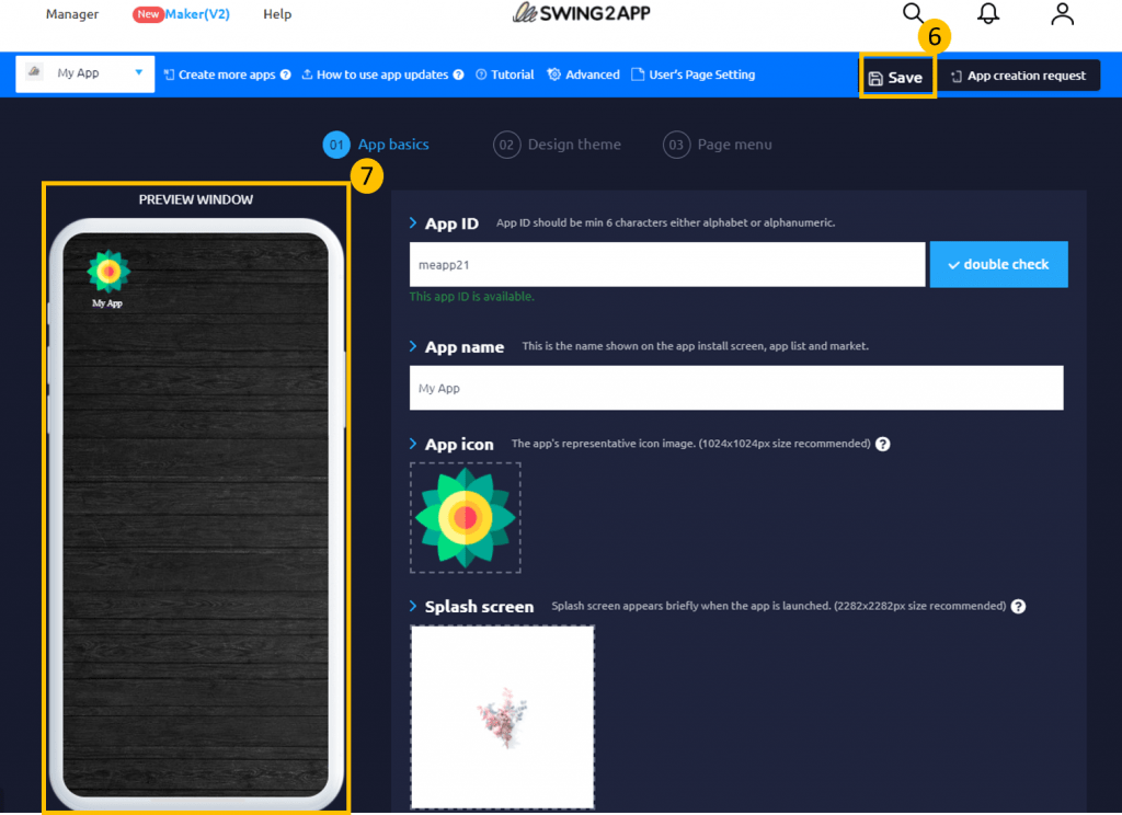
7. Lastly don’t forget to save your progress, by clicking on Save.
8. In the app preview screen you can view your applied App Icon.
You can also check out our tutorial on App Icon:
Conclusion
Although a tiny square symbol can appear trivial on your smartphone screen, it matters greatly to your business image and affects the number of downloads. A well-designed app icon design can improve your conversion rates, so keeping it consistent, recognizable and up-to-date is important. And don’t forget to do quality assurance monitoring.
With Swing2App all you have to do is create an app icon image as per the recommendations explained above and your icon is all set for all kinds of android and iPhones.
Have you created your app icon, then sign up for Swing2App no code app maker and create your own app easily.