If I ask you to think about your most used app, what comes to mind? Probably the beautiful app icon along with the app name ringing in your head. An app icon has the ability to stick into people’s minds even though it is only a small component of app building.
If you are trying to increase your app downloads on the App Store, then keep in mind that your app icon greatly impacts whether your app is instantly recognized and downloaded or simply skipped by the users.
App icons serve as graphics representations of your app on the app stores, so they really define your brand and the first impression your app makes on potential buyers. You’re likely to lose your potential customers if you make a poor first impression. In fact, more than 90% of people give the most importance to visual factors when making a decision.
Don’t let people ignore your app! Here are some tips on how to make a mobile app icon and tips to make your app icon stand out.
TIPS TO MAKE A MOBILE APP ICO
CHOOSE A UNIQUE AND BOLD SHAPE FOR YOUR PERFECT APP ICON
Simplicity is key to creating the perfect app icon that’s both memorable as well as recognizable. Choosing a unique shape is a must to stand out from the market, if you just use a copycat icon that isn’t unique enough then fewer people will be enticed to download it.
Furthermore, it is important to note that your perfect app icon must also reflect the functionality of your app. For example, if your app provides some educational service then it would be a great idea to include a book or a pen in your icon that too with a bold and unique color palate.
The Spotify app icon is a great example of a incorporating unique and bold shape that reflects the app’s purpose into the app icon design.
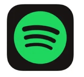
Spotify has chosen two basic colors and a simple shape, which makes the icon easy to recognize as well as remember. These basic shaped black lines inside the green circle represent increasing speaker volume: reflecting the app’s purpose “to stream music”.
Here’s another example of an app icon that isn’t so great:

This app icon has way too many elements. You might not be able to tell what’s going on as it’s quite difficult to understand all of the elements and what they mean. And because the people are going to view it as an even smaller version of this image they won’t be able to gather much out of this app icon.
So, your app icon icon design doesn’t have to represent exactly what your app does, it should represent some aspect of the overall functionality in a sophisticated manner. Having a simple yet bold app icon makes people quickly understand the value of your app just by looking at the app icon.
AVOID USING A PHOTO IN YOUR APP ICON
Generally, you should avoid using a photo as your app icon. However, if you really want to use an image as your app icon it would be better to convert it into a vector image or a 3D image. Use that image only if it is both simple and bold, and truly represents your brand.
You can also use some of the elements from the photo to inspire your vector image design, like this design by the DeepArtEffects app:

DON’T OVERLOAD YOUR PERFECT APP ICON WITH COLOR AND DETAIL.
When you are creating your app icon, you must remember that the app icon will appear quite small on the user’s screen. So, if you include too many colors or too many details while making your app icon, it could stop your app from standing out in the huge app market.
It is advisable to limit your app icon’s color palette to two or three colors if possible, and not overload the app icon with detail. The simpler your app icon design, the more it’ll stand out from others.
Take a look at the Snapchat app icon: it is one of the best examples of an app icon with a simple color palette and design.
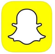
The app icon of Snapchat is a simple design with rounded corners. It uses only 2 colors: white and yellow, but a black outline for the white ghost to make it pop out. Moreover, the basic design is also quite simple “ the basic ghost”. This is what a simple yet bold app icon actually means!
If you go through the two app icons in the app store, you might also notice that many app icons tend to have similar color palettes.
Red and blue color palettes dominate the app icons, green comes next. But you’ll notice that most of the top app icons tend to use just one or two colors. It would be a good idea to design your app icon within these color palettes.
Moreover, don’t forget to ensure that the colors you choose align with your brand. The color palette of your app icon design should be the same as your app theme design, and it should also attract your potential audience.
Another pro tip for you is to use color contrast the efficient way in your app icon design to make your app icon more attractive.
EXCLUDE TEXT OUT OF YOUR APP ICON.
You know very well that your app icon will look quite small on a smartphone screen, meaning that users won’t be able to easily read any text you place on your app icon design.
So, it is advisable not to include any text in your app icon design. If you create an attractive app icon and app name, you will able to draw people in easily to download your app. Then, they can look at the app description to learn more about your app.
However, avoiding text doesn’t mean you can’t even use a few letters! For example, Facebook uses a small case “f” in its app icon and it is one of the leading social media apps out there. This app icon design works for them because it is the perfect combination of a bold, unique shape that reflects an already well-known brand. So, if your brand is already well-known and you are launching your app, you may be able to create an app icon with just the letters that represent your brand well like MacDonald’s “M”.
So, if you want to use the initials of your app name or your app name is a short three to four-letter word then you can think about using it in your app icon like the Dunkin Donuts app.
If you are a new brand looking to go digital then, you must with something a unique app icon that reflects your app’s functionality.
USING BORDER FOR YOUR APP ICON CAN BE A GAME CHANGER
Taking the example of Snapchat again, they have used a border not only around the main ghost in their app icon but also around the entire app icon image. Another example of a good app icon border is the Adobe Photoshop Express app icon:
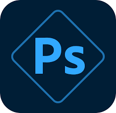
The overall app icon design is simple and has only the initials of the app name but the border makes the app icon stand out.
Using a border for your app icon gives it a certain depth and creates a focus on the contents within the border, this makes your app icon more impactful. Hence, using a border around your app icon makes it stand out in the app store and that can increase the app downloads.
You can get more creative with the border by creating a 3D effect like in this Turbo driving racing 3D app icon:

However, keep in mind the color contrast we talked about earlier. The app icon’s border should have a strong color that contrasts well with the colors within the border, only then your app icon stand out and attract potential customers.
STUDY THE MARKET AND ANALYZE YOUR COMPETITORS’ APP ICON DESIGNS.
In any kind of planning market and competitors research is a must. When you study the app market and analyze your competitors, you’ll be able to easily narrow down the choice of color palette and app icon design aspects that could help you stand out the most. For example, gaming app icons are more colorful, and vibrant and even use 3D elements. So, if you are creating a gaming app then these are basic features that your app icon must include.
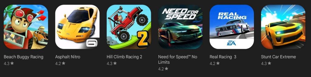
All these are racing gaming apps and their app icons aren’t all the same, but there’s a common theme theme(the racing car) in all these app icons. Most of these app icons include a picture of a racing car, and all of them use bright colors like red and green or blue or yellow and white as the color palette.
You might choose a different color palette to stand out from these competing apps, but you must display the racing vehicle. You could get creative and choose another symbol like a steering wheel, but you should choose an app icon image something that represents the app’s purpose.
It takes very little time to analyze your competitors, so there is no reason to skip this essential step in designing your app. If you ignore this step, you might end up with an app icon that is just a copycat app icon which can result in app rejection from the app stores.
CHECK YOUR ICON ON A PHONE SCREEN BEFORE YOU MAKE A FINAL DECISION.
When designing your app icon you might think it is the perfect app icon, but it might not actually look great on the mobile device. Hence, you’ll need to check it yourself how it will actually look against the various mobile device wallpapers (Will it look equally good against various colors or not?).
With customizable and live wallpapers in the market today users have a unique wallpaper, so you want to ensure your app icon looks great against a range of colors.
MAKE SURE YOUR APP ICON IS THE RIGHT SIZE.
When you create your app icon design, it must be proportionate to the size of the screen it’s going to be viewed on. This is a compulsory step for iOS app icons – Apple will straightaway reject you’re your app if you don’t create the right app icon size.
So, if you want to publish your app in the Apple app store, carefully read their app icon size guidelines and make sure you follow each and every instruction. Create your app icon by following them carefully and making sure your app is accepted.
App icon design specifications for the Apple App Store
Follow Apple’s Human Interface Guidelines when designing app icons for the iOS ecosystem. Your app icon should work well in multiple sizes to suit various devices:
- 180 × 180px @3x or 120 × 120px @2x for iPhones
- 167 × 167px @2x for iPad Pro
- 152 × 152px @2x for iPad and iPad Mini
- 1024 × 1024px @1x for the App Store
The good news is, that you only need to submit one 1024 × 1024px PNG file, and the platform will automatically resize the asset to fit various devices and sub-menus.
Apple also offers additional guidelines: Your app icon design should prioritize simplicity, be readily recognizable, and act as a focal point for the user experience. Avoid using a complex background, flatten the image (in other words, no transparency) and only include text if it’s an essential part of the brand identity. Lastly, don’t put photos, screenshots, or interface elements in the graphic.
App icon design specifications for Google Play Store
Google’s Material Design guidelines offer detailed recommendations for app icon design. Here are some key points to keep in mind:
- The final size should be 512 × 512px. The platform will scale it automatically.
- The file should be in 32-bit PNG format.
- The color space should be sRGB.
- The file must be no larger than 1024 KB.
- The shape should be a square without rounded corners — the platform applies a mask once you upload the file.
Use the entire asset space (512 × 512px) as the background and the keylines, set at 384 × 384px, to position logos, icons, or graphic elements. Don’t add a drop shadow to the design because the platform will add it once you upload the file. However, you can add shadows to graphic elements within the border of the app icon. Also, avoid using promotional or branding badges in the artwork since they often don’t scale well.
A/B TEST DIFFERENT APP ICONS.
By doing this, you can eliminate confusion and will be able to select the perfect app icon design and decide which one will attract your target audience the most.
You can just use the Google Play A/B testing tool if you’re releasing your app for Android. For all Android app icons, this is perfect. Try A/B testing your app with your Facebook audience if you’re releasing it for iOS or anywhere else other than the Google Play Store. It will cost you some money, but the insight you’ll acquire will be worthwhile.
ONCE YOUR APP LOGO IS READY, USESWING2APP TO ACTUALLY CREATE YOUR APP WITHOUT ANY CODING.
With Swing2App you just need to create one size app icon, and it will be automatically made suitable for all other screen sizes for both Android and iOS.
Read to know more about how to create an app icon for Swing2App no-code app builder.
TO SUM UP
Now, you know everything about how to design the perfect app icon to attract potential customers.
I hope this guide will help you design the perfect app icon for your brand and publish your app in the market soon!
All the steps mentioned above will definitely help you in creating the perfect app icon, however, A/B testing is the most important to find out which app icon design is actually the best.