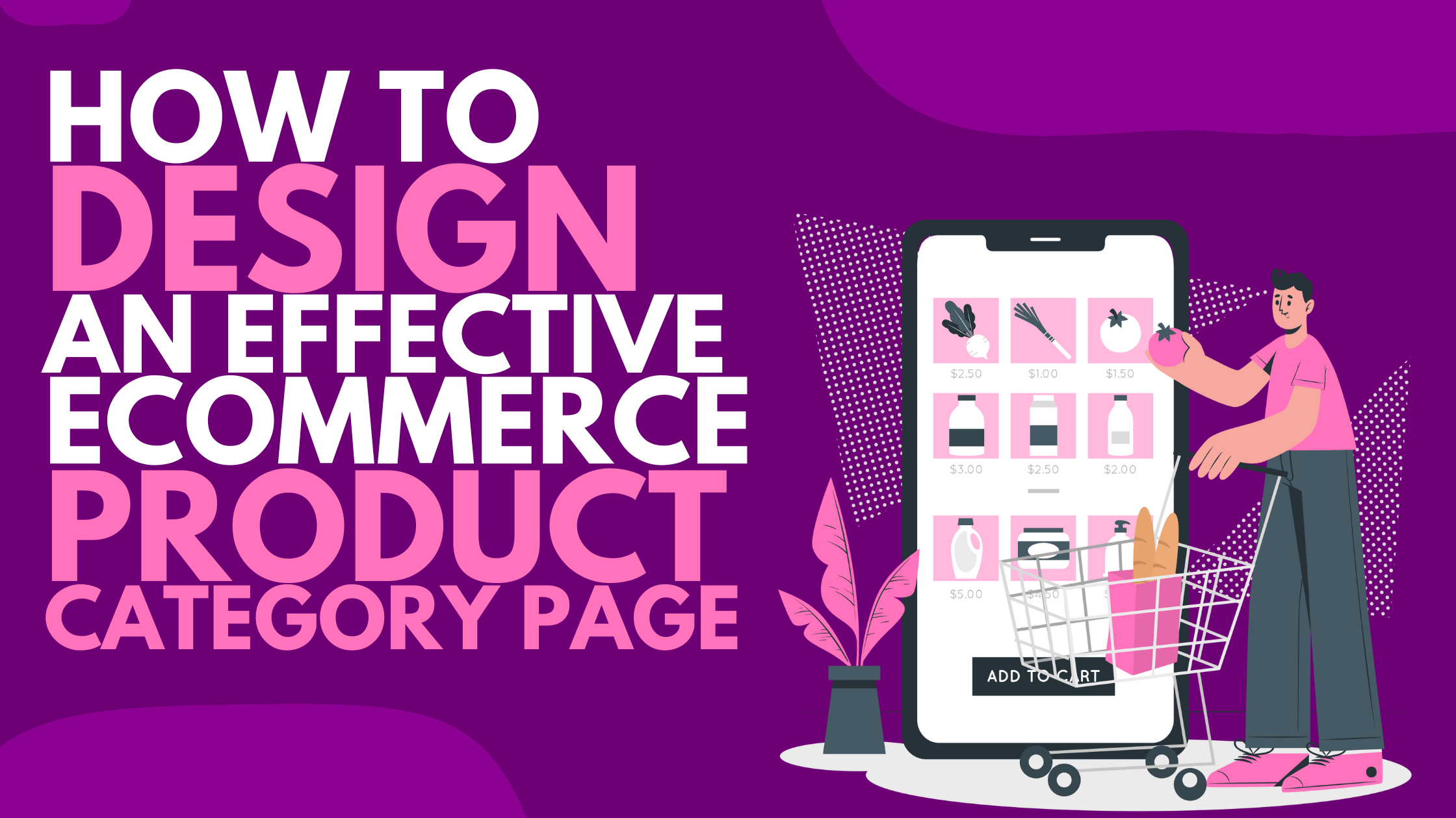
The product category page is an important step in your customer’s purchasing journey. Keep these guidelines in mind as you create it.
“The best ecommerce website design helps visitors to easily find desired goods, compare them to make a better choice, a quick checkout procedure and delivery of items ordered with minimal friction.” Is this true or not?
Before you respond, imagine yourself in a local brick-and-mortar store.
Which do you value more: a store with clear signage, properly labeled items, and a short line at the register or stores where you can get lost, wandering through a labyrinth where you can spend hours without buying anything?
If you answered, “It depends,” you’ve discovered an important marketing lesson. The best stores assist on-purpose shoppers in getting what they want and moving on, while allowing browsers the luxury of exploration.
In a physical store, that can be a difficult bill to fill, but it is entirely possible in ecommerce. And the central point of it all is one page: Product Category. Get it right away, and you’ll be on your way to getting rave reviews from satisfied customers. If you fail there, you… well, you fail.
Let’s look at the best practices for product category pages. The ROI on reviewing and sharing this article with your team could make it the best-leveraged decision of the year.
There are two approaches to ecommerce optimization: difficult and simple.
The difficult way: try everything you can and hope something sticks.
The simple way: understand the buyer’s journey and remove obstacles to conversion.
Let’s start with the easy way. It is not only more enjoyable, but it is also far more effective.
KNOW THE PURPOSE OF YOUR PRODUCT CATEGORY PAGE
Every page on your website serves a specific purpose. Your job is to understand that purpose and grease it as well as you can so that the visitor can easily progress to the next step on the path leading from discovery to purchase.
The two most important page types on your ecommerce app or website are as follows:
1. PRODUCT CATEGORY/ TYPE
2. PRODUCT SPECIFICATION
The first enables the visitor to choose the next step in the journey. The second provides enough information to either seal the deal or direct the prospect to a more appropriate product.
If you get those right, you will make sales. You’ll confuse your visitors if you mess up them.
Best practices for product detail pages have already been discussed. The product detail page (PDP), as stated in that guide, is where “the prospect will decide whether to purchase your product or continue looking.” The PDP encourages the prospect to delve deeper. It provides detailed information about the product being highlighted, assisting the consumer in their research.
This is not the case with the product category page, which an important thing that many ecommerce app designers ignore. It is at a crossroads in its sales trajectory. It’s an intersection where the visitor must decide which way to go… However, it lacks detail. “Choose and keep moving,” it says.
The category page’s job is to make that decision as easy and painless as possible.
Shoppers on a mission can quickly take the next step towards becoming an owner, and browsers can choose which section of the store to explore next.
The category page must be obvious & minimal:
Obvious in the sense that the options it offers must stand out and be easily identifiable (this isn’t a page for obscurity).
Minimal in the sense that it must never draw attention to itself; instead, it must clearly point to the product categories it displays.
Determine the purpose of each page and ensure that the page is optimised to fulfil that purpose. That maxim is a strong contender for the title of “First Rule of Category Page Design”.
A clear path through your store also helps your SEO efforts because you can use relevant keywords at each step of the journey. If a customer searches for “Ladies Sandals,” Google will direct them to your sandal product category page, where they can find the appropriate product listing or discover other items in your collection.
BUILD A CUSTOMER-CENTRIC PRODUCT CATEGORY PAGE
Your product category page serves as a traffic director, and it is your responsibility to put up helpful road signs.
As a result, the best-designed product category pages begin with maps.
One question is central to the process: what information does the visitor require to continue on the sales journey?
Assume you have an ecommerce website that sells women fashion items. What information do your visitors need to know at the category level?
Remember that you don’t want to sell guitars on the product category page (though you should use every opportunity to build confidence in your ecommerce brand and products). You want to be of assistance. You want to assist the prospect in taking the next appropriate step.
Here’s a short list of Women Fashion categories:
- Dress
- Pants
- Tops
- Activewear
- Loungewear
- Nightwear
- Watches
- Jewellery
- Sunglasses
- Sports shoes
- Sandals
- Hand embroidered
- Luxury store
- And others, depending upon the product range you offer.
You could argue that having too many categories will confuse the visitor. And you are completely right. On the product category page, most ecommerce stores will need to use special features (for example, sort by brand).
To get to the bare essentials, you must first understand your audience, the search terms they use (keywords), and how they approach the task of finding products in your niche.
The last thing you want to do is create categories based on terminology you use rather than the terminology used by your potential customers.
If your products aren’t searchable, your ecommerce store doesn’t exist. It is critical that you understand the words your customers use to describe your products and how they categorize them in their minds.
Your job in an ecommerce store isn’t to create a website that makes sense to your staff, peers, or industry; it’s to make sense to the people who buy what you sell.
This could spark a discussion about keyword research and user testing. But, for the time being, we will not go that road. The goal here is to focus on the elements you’ll want to include on the page rather than how to choose those categories. But don’t overlook this important point: effective product category pages begin with research and strategic planning.
Let’s start with a list of the elements that almost all product category pages should have. Then we’ll look at extras that may or may not apply to your company.
ESSENTIAL ELEMENTS OF PRODUCT CATEGORY PAGES
Here are the two basic elements:
PRODUCT CATEGORY NAME
Every case is different, but you should typically use the product name that your prospects use for the category or individual products, rather than a branded or esoteric name. This not only helps customers understand your categories, but it also helps search engines find them.
On their primary product category page, the Women’s fashion items online store may choose to go with Tops/T-shirts, Jeans/Pants, Dresses, Activewear, and innerwear. This would allow visitors to take a giant step closer to locating the exact guitar required. The following category selection would delve into the specifics of each of those main categories. Using cute or branded terms like “cute H&M top” or “shimmery dress” is probably not a good idea.
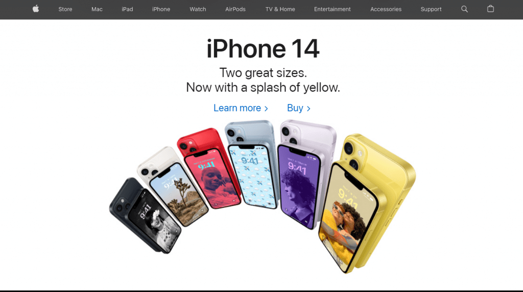
Look at Apple’s major product categories: Mac, iPhone, iPad, etc. Displayed at the top of the website.
CATEGORY IMAGE
Make certain that this is a generic image that represents the entire category. Make it the product’s hero image on its own. The more straightforward and obvious the better. The images should be the same size but stand out as distinct from one another. The eyes will lead the way, and the minds will follow.
For example, the guitar store would not use a photo of a Gibson or Ovation guitar. The image should not highlight any specific brand’s distinguishing features. Instead, it would use a stock acoustic guitar, a stock electric guitar, a stock classical guitar, and possibly an image of a guitar case, strings, and capo as the accessories icon.
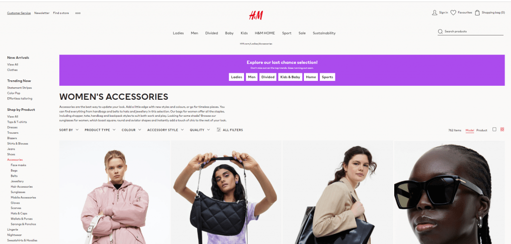
Examine how the H&M ecommerce site handles categories and subcategories (see screenshot below).
That’s it.
Your product category pages should begin with the most logical first decision point for your visitors: Name and classification.
From there, guide them through subcategories to the next logical decision, and repeat as necessary until prospects arrive at the Product Detail Page for the item they’ve chosen.
The sequence does not change, but the method of traversing it does.
Let’s move on to the features that are most likely to be useful to shoppers as they navigate through the primary category, subcategories, and finally the selected Product Detail Page.
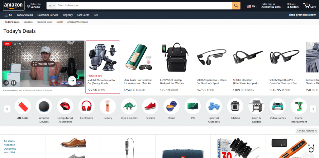
CATEGORY PRICE RANGES
Depending on your products, listing price ranges at the Category Page level is frequently beneficial. This assists in qualifying customers and can help to avoid disappointment.
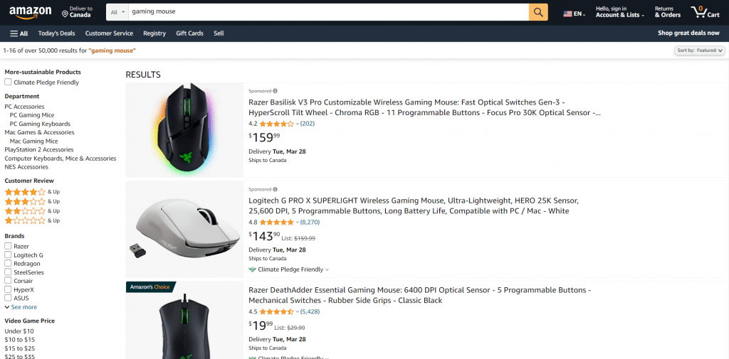
For example, Amazon product filter options include price range too, as shown below.
It is usually preferable to give customers the option of selecting the price range that best fits their budget rather than leading them to a product that is way out of their price range. The sales department may disagree with the strategy, but we’ve found that well-informed customers are usually the happiest.
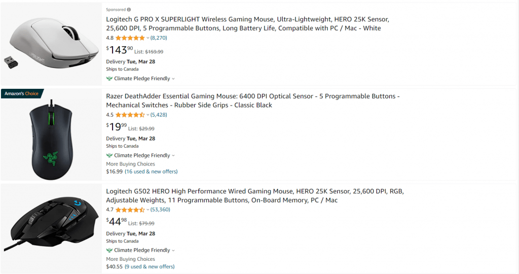
CATEGORY RATINGS
Ratings and reviews can be useful additions to product categories. Here is where the sales department may be able to help. Shoppers will frequently pay more for higher quality… and the reviews usually reflect the quality.
Here again we can take the example of e-commerce tech giant Amazon, where each product displays ratings.
FEATURED ITEMS
Don’t confuse the shopper, but don’t be afraid to make recommendations. Featured items, depending on their placement, can catch the eye and lead to a larger sale.
Take note of how Amazon handles the positioning of their “Featured deals” (see screenshot below).
FILTERING
When product category page filtering is optimised, conversion rates can increase by 20% or more. There is no simple solution, and no one-size-fits-all prototype.
We start by assessing the site to look for roadblocks in the conversion sequence, then we work with the client to create an individual strategy, test the assumptions, and optimise for conversions leading to sales.
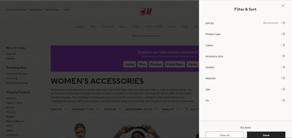
For example, H&M provides shoppers with multiple filtering and sorting options to make their journey easier.
This is an area where you can keep things simple and effective, or you can get elaborate and effective. Just make sure to keep the “effective” part!
AWESOME ECOMMERCE CATEGORY PAGE EXAMPLES
APPLE
Apple is self-explanatory. For years, the company has been developing ground-breaking products and has a massive (and devoted) fan base all over the world. Every Apple product is designed with passion and innovation, combining style and functionality.
Everything Apple does is noteworthy, and their category pages are no exception.
Apple’s main page features colourful and clear images of its products, as well as appealing contrasting backgrounds. The latest iPhones are displayed first, followed by the Apple iWatch and iPads as you scroll down.
The minimalistic, sleek and modern design of the website makes it a clear winner.
When you select the iPhone category, all of the most recent iPhone gadgets and accessories will be displayed at the very top of your screen. Furthermore, each icon and its labels are large enough for users to easily browse through options without having to squint or zoom in.
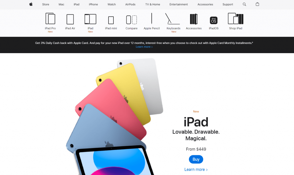
As you scroll down the page, bold and colourful images of various iPhones appear on your screen. The “Which iPhone is Right for You?” section distinguishes this category page from the rest.
Product comparison features are also available on Apple’s category pages. You should definitely consider including this functionality on your eCommerce pages to assist customers in making faster purchasing decisions.
H&M
The design of H&M’s online store is similar to that of its physical stores. It has a simple white layout and features aesthetically shot images of models wearing their clothes and accessories.
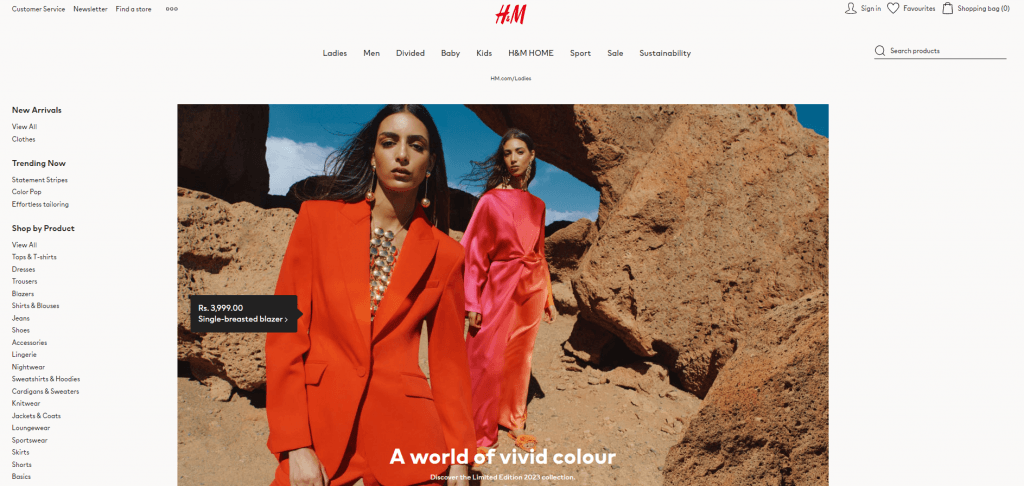
The company does an excellent job of categorizing its products. There are sections such as “Offers,” ” Trending,” “New Arrivals” and “Shop by Occasion.” Other filters, such as size, pattern, and color, among others, help to narrow your search even further.
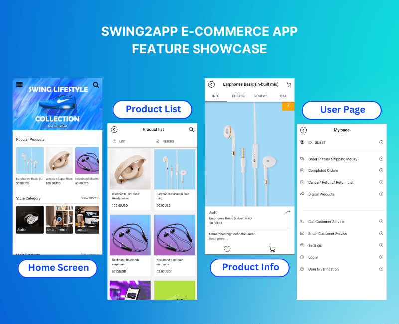
CREATE AN APP WITH SWING2APP & CREATE PRODUCT CATEGORIES AND OTHER FEATURES WITHOUT ANY CODING
Many eCommerce stores have already well-established websites created using leading website builders like Shopify, Wix, WooCommerce, or any other brand. You might also have a website for your small business that is built using one of these platforms. If not and you want to learn more about website development, please visit our blog: What Is The New Way Of Running A Store In 2022?
If you have a website already, you can easily convert your website into an app in just five minutes with Swing2App’s no-code app builder!
Additionally, you can use Swing2App’s prebuilt templates to create no-code apps faster and easier than ever before. You can, however, also you can create no-code apps from scratch. A majority of must-have features for an e-commerce app can be included in your app without coding using Swing2App no code app builder.
Following are a few examples of e-commerce apps that can be made using the Swing2App no-code app builder.
Further, also read about: GUIDE TO E-COMMERCE APP DEVELOPMENT: STEPS, KEY FEATURES And SWING2APP NO-CODE BUILDER
Also watch our YouTube guide:
CONCLUSION
Apply the tips in this guide to compete with the most successful eCommerce brands, and don’t forget to cater to your mobile shoppers—up to 51% of your customers may be coming from mobile.
Don’t make assumptions; instead, use A/B tests to implement changes that your customers will appreciate. Product discovery should be performed on competitors’ websites in order to learn their shiny secrets.